Golfr: Connecting Local Golfers
Position: Lead Product Designer
Project Type: End-to-End Product Design
Product: iOS application
Timeline: Feb 2022 - Current
The Problem
Golf typically is played in groups of 4. However, new Golfers do not usually have an extensive network of golfing partners, which results in missed opportunities to enjoy the game with others.
The Solution
To enable golfers to easily pair up with one another, based on experience level, attitudes, shared interests, and location.
On a broader level, Golfr aims to alleviate all of the pain points associated with today’s on-course “matching” experience, as well as to foster a greater sense of community among local golfers.
Project Summary
Strategy: As Lead Product Designer, I maintained an awareness of our constraints, our competitors, our pace, and our audience as I moved through the design process. I compiled research insights and used them to optimize the functionality for relevance given the current needs of the golf community, I prioritized functionality that would add the most long-term value for an MVP (to guarantee a high degree of “stickyness” for initial users), all while making sure to remain as lean as possible. I managed 4 UI/UX designers and informed stakeholders of progress regularly.
Design: I delivered a fully comprehensive catalog of high-fidelity prototypes, user flow diagrams, app map diagrams, and a detailed Product Requirements Document (PRD) that encapsulated the app’s full scope and functionality. My design process to arrive at this point included extensive user research (target audience surveys, online market research, competitive analysis), designing the user interface (from low to high fidelity), multiple rounds of usability testing and iteration.
Envisioning Our Value Proposition
As a starting point, I used my existing reach (my immediate golfing network) to find the answers to our most pressing questions and assumptions. This guided our first “iteration” of the application and all of the functionality involved.
I hosted 20-40 minute interviews with 6 different people (of varying levels of golfing expertise), asking basic questions to determine behaviors, wants, and needs. I carried out usability testing on a very rough initial prototype to get a sense of how people received the interaction design.
Below is a snapshot of this feedback, which was clumped into themes and used to iterate on not only the interaction design but the value proposition/functionality as well.
Considering our Competitors
There was no shortage of useful golf features that we could add to make our app “stickier” (distance finder, scorecards, betting, booking tee times). But, with dozens (possibly hundreds) of golf apps on the market, we could easily seem redundant.
I observed that some apps had dozens of features, at the expense of their ease of use.
I also observed that some apps had very little functionality, but sometimes did or didn’t do it well.
Asking the right questions…
What was the right combination of functionality that would still fit with the general theme of “Connecting Local Golfers” but also guaranteed additional long-term value, without cluttering the interface?
This graph ranks potential functionality based on how much growth it could offer (buzz and engagement generators). This was informed by our survey insights.
This question became the focal point of our second round of research. The Survey. This step gave me concrete and clear ideas of what functionality was most desirable.
I could then do research to determine what was most feasible, based on constraints, to arrive at our ultimate “catalog” of functionality.
In the graph below you can see the features that brought the most appeal/value among our audience, ranked based on feasibility. Our MVP would pack as big of a punch as possible for the budget that we had.
Lets talk about The Survey: Thanks to a strong marketing campaign, we garnered an email list of 5,000+ users that we could question.
This phase would not only give us a better understanding of what our users needed but brought along numerous pivotal insights.
Audience Survey: Uncovering Pivotal Insights
Ultimately, I sent our survey out to 500 of our 5,000 email subscribers. This yielded 58 responses and a lot of pivotal information that would guide my efforts moving forward.
The focus of the study was to:
test any remaining assumptions about what the users wanted
fund out what functionality they perceived as most valuable
understanding our target audiences’ general demographics, interests, and attitudes
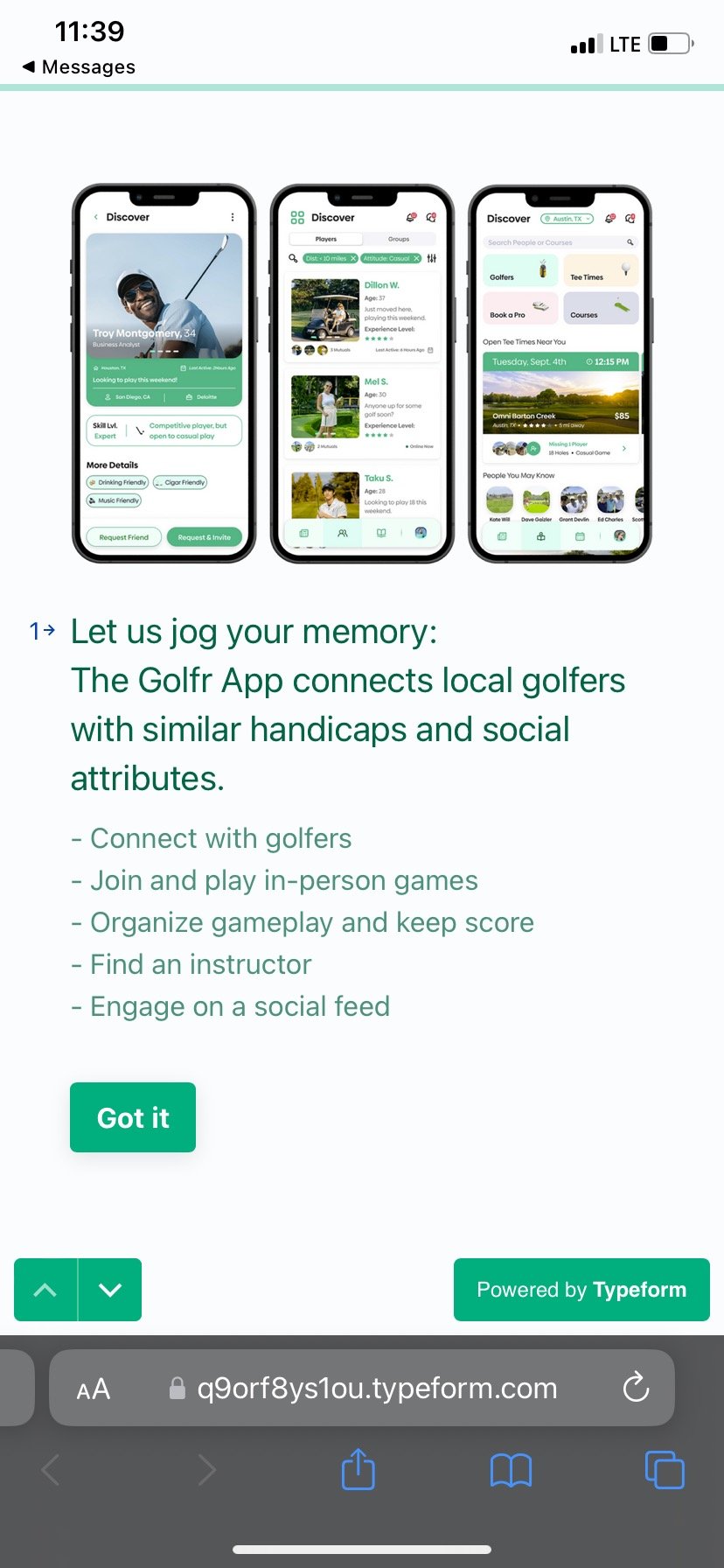
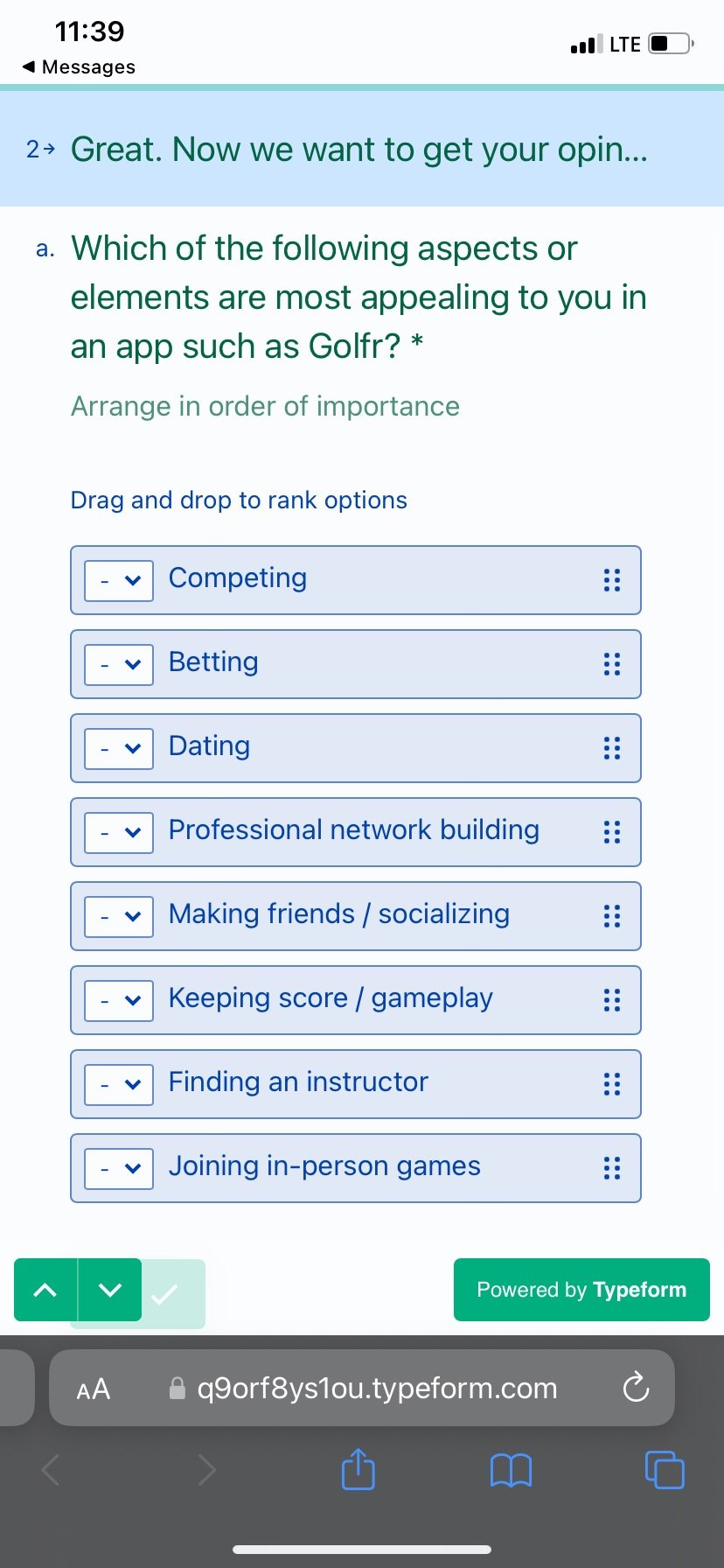
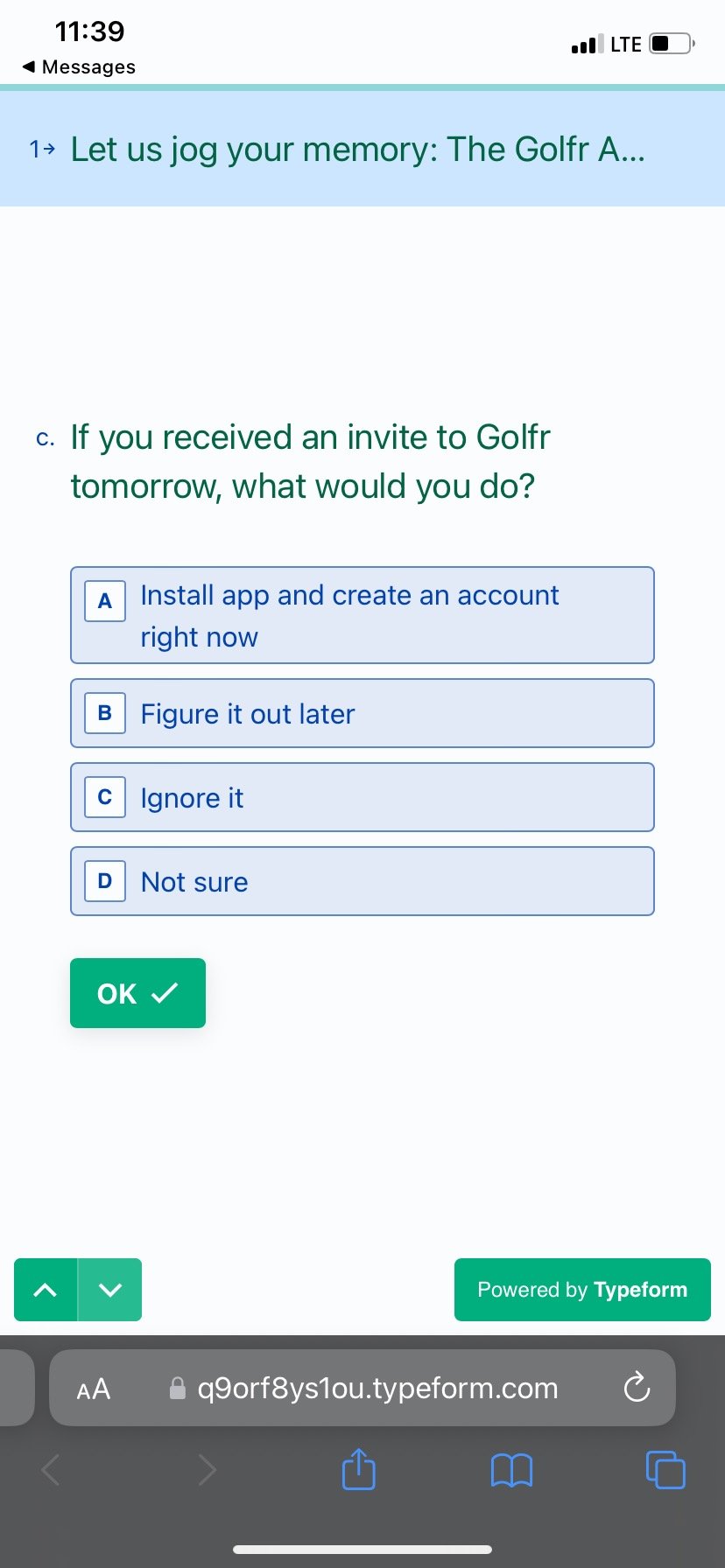
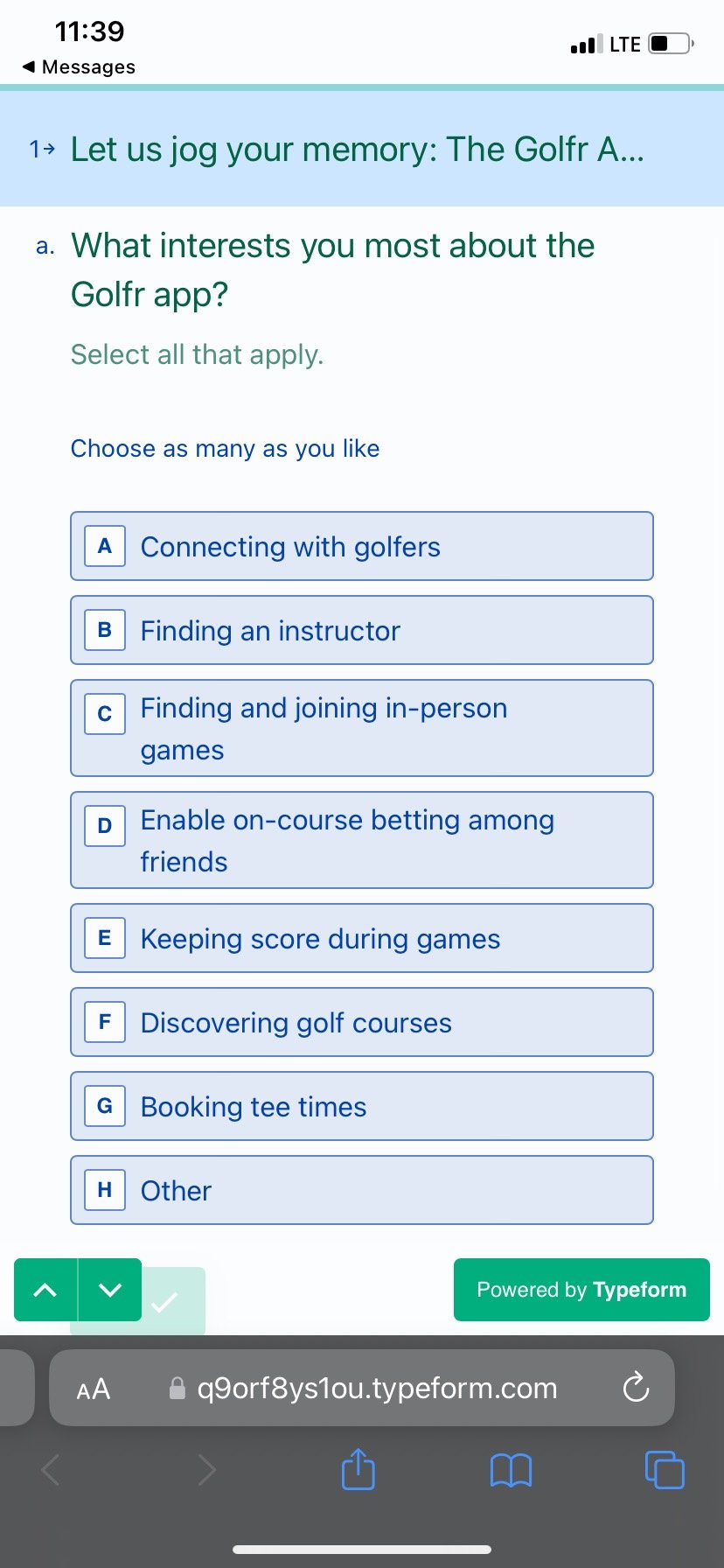
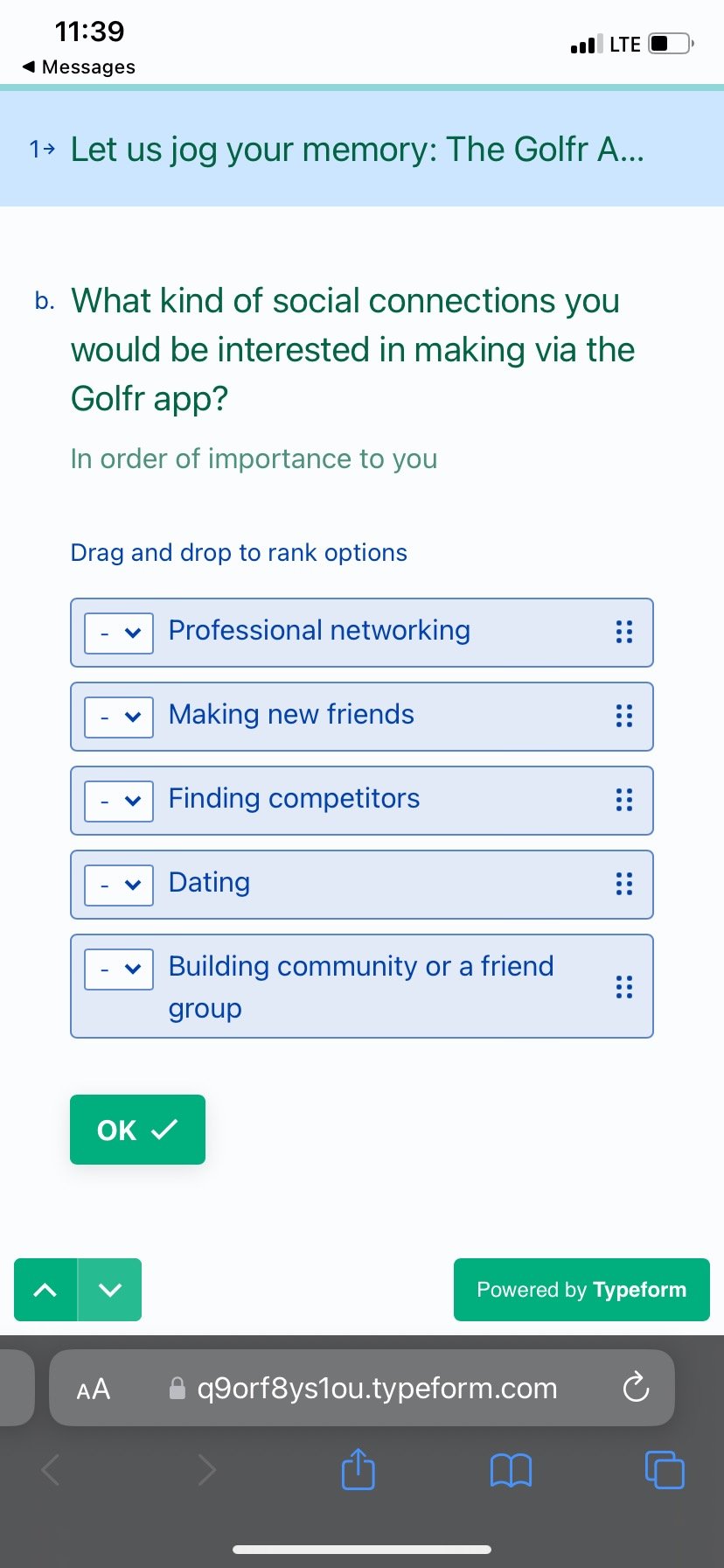
Pictured below are some of the questions we asked in the survey.
Target Audience Survey
How did these insights inform my design?
Pre-survey ideation was informed largely by the interests of our stakeholders and data we got from talking to people (friends, interviewees, etc.). But our survey insights showed us that some of the proposed functionality (on-course betting, scorecard functionality, and finding an instructor) was not interesting to people who signed up for our mailing list. Instead, we saw that these people were more interested in being “plugged in” to larger golf communities.
Examples of “pre-research functionality”:
In-app betting
In-app scorecard
Finding an instructor, tracking progress
Examples of “post-research functionality”:
Player “grouping” functionality
Large bulletin/chat boards known as “Communities”
This was not only a much simpler solution, but it was more in line with our original mission: to connect golfers. While this decision would disappoint our stakeholders, I was confident that this redirection would be of greater benefit to the app in the long run.
Story Mapping
The insights derived from The Survey would greatly disrupt the design pace/approach. But, it would also greatly simplify it. In order to move forward, I’d have to:
Communicate to stakeholders about our insights and how I’d like that to inform our new approach
Onboard multiple UX/UI designers to speed up the prototyping process (and move into development)
Be prepared to have conversations with developers about the limitations and vision surrounding the desired functionality
I would accomplish this by carrying out a Story Mapping workshop to:
a) unify the understanding of the app’s scope and limitations
b) share the “why” behind decisions that were made
c) identify any gaps in functionality or research

Product Requirements Document (PRD)
The Story Map would become the centerpiece around which the PRD would be built. Because Story Mapping is a document that gets drafted during a workshop and in the form of a conversation, we would be able to get fully aligned as a group about what the app’s core offering would be and why. This structure also served as the jump-off point for the remainder of our prototyping and documentation work.
Methodology:
The following is the format that I required of any UX designers who helped work on Golfr:
Treat each column in the story map as a “slice” of functionality. Each Tuesday, we meet and delegate pieces of functionality (columns) to design.
The designer should build a corresponding userflow diagram for each slice, as well as its mid-fidelity prototype.
During our weekly (sometimes bi-weekly) stand-ups, each designer (who had been delegated a few slices per week) would demonstrate their prototype and substantiate any decisions that were made. During these conversations, we’d often provide lots of feedback and would revisit the prototype the following week.
This system allowed us to diverge and converge on a regular basis. During divergence, designers would be free to practice their own design process, and during convergence, there would be a session where they would demonstrate their thinking, ensure their design fits in with the larger architecture, and provide feedback for other designers. Not only was this a great way to tackle the prototyping at a fast pace, but also allowed us to learn from one another.


